Taimi Undergoes First Major Rebranding
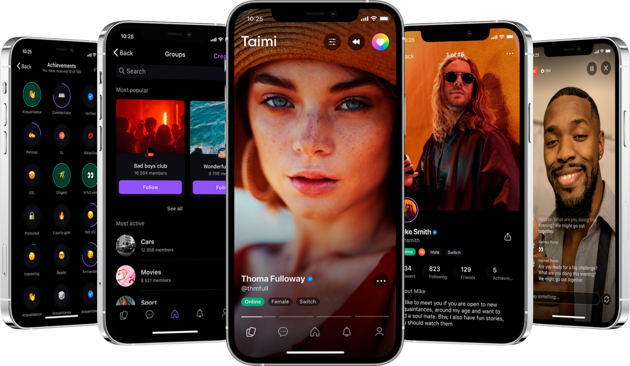
Taimi has undergone a full redesign, incorporating a new logo, new branding, and an upgraded app interface.
The LGBTQ platform includes a social media channel as well as a dating app. To unify both streams, integrate the design into the app’s code, and simplify further tech and visual app development, Taimi also created a universal design system.
It is a set of digital tools for designers, developers, and testers meant to simplify the work process and improve interface quality.
This update stands as the first major redesign that the app has undergone since its launch in 2018. The new design has been set around the age of digital culture, and the changing landscape.
It applies to the many new branching projects, social initiatives, and tech features Taimi plans to introduce in the future.
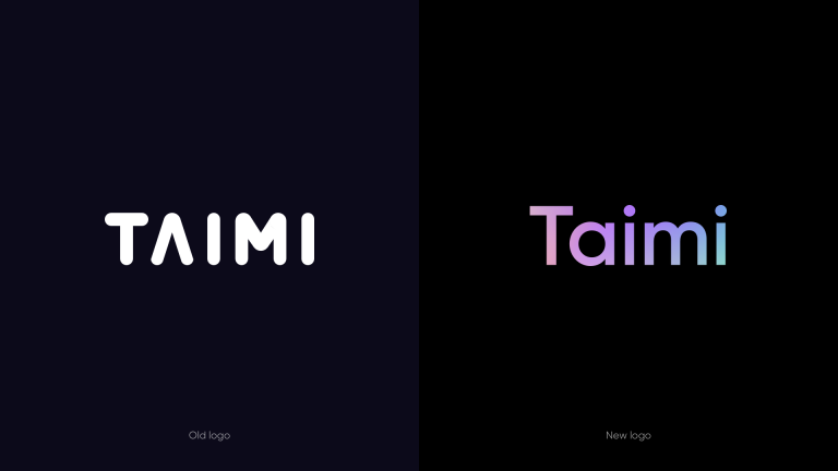
Jake Vygnan, Co-founder and COO at Taimi, said in a statement: “When developing the new branding, our main focus was on the diversity of our platform and our users, and how crucial it is to represent this feature in our new identity. Our new brand identity allows us to fully utilise any colours for our visual communication without prioritising one over the other.
“Rainbow gradients and colour mixing symbolise the diversity of the LGBTQ+ community. This branding allows us all to appreciate how unique Taimi users are — each of 8 million people!”
Visit the Taimi website here.