
Instagram Updates Branding for the First Time in a Decade
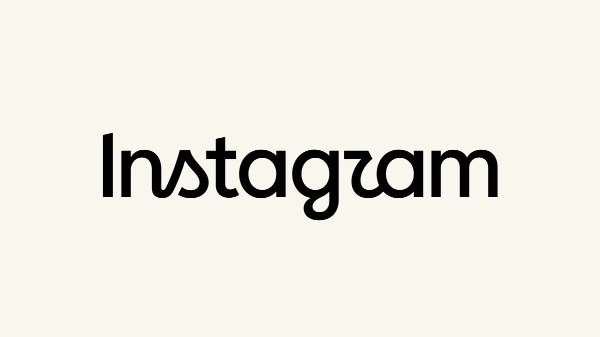
Instagram has introduced an updated visual identity, marking the first significant refresh of its branding in more than a decade. The update includes a redesigned wordmark alongside new fonts, icons and other elements of the platform’s broader brand system.
Instagram Chief Adam Mosseri said the previous wordmark had begun to feel dated and described the new version as a sharper, more modern interpretation that still references the platform’s original identity.
The changes are relatively limited in terms of how they affect the user experience. At present, the most visible update is the Instagram wordmark displayed within the app, rather than a wider redesign of the platform’s interface or functionality.
The refresh has nevertheless generated a mixed response from users. Mosseri’s announcement posts on Instagram and Threads attracted more than 5,000 combined replies shortly after publication, with some users questioning the new typography. In particular, the styling of the letter “r” has drawn criticism from people who say it can resemble a “z”.
Others have used the discussion to raise broader complaints about Instagram, arguing that visual branding changes are less important than improvements to the core experience, including how users see content from accounts they follow.
For Instagram, the rebrand provides an opportunity to update an identity that has remained largely unchanged since the early 2010s. The platform has evolved considerably during that period, expanding from a primarily photo-sharing service into a broader video, messaging and creator platform.
