
Tinder Undergoes First Major Rebrand in Nearly a Decade
Tinder has launched its first comprehensive rebrand in nearly ten years, introducing a fictional persona named “T” as a central element of its new identity.
The redesign, developed with design studio Porto Rocha, positions “T” as a trusted dating columnist who offers advice and reflects the app’s tone across its interface. Strategy and copy director Natalee Ranii-Dropcho explained that the character draws inspiration from traditional advice columnists, aiming to sound like a knowledgeable friend who has experienced dating challenges and successes.
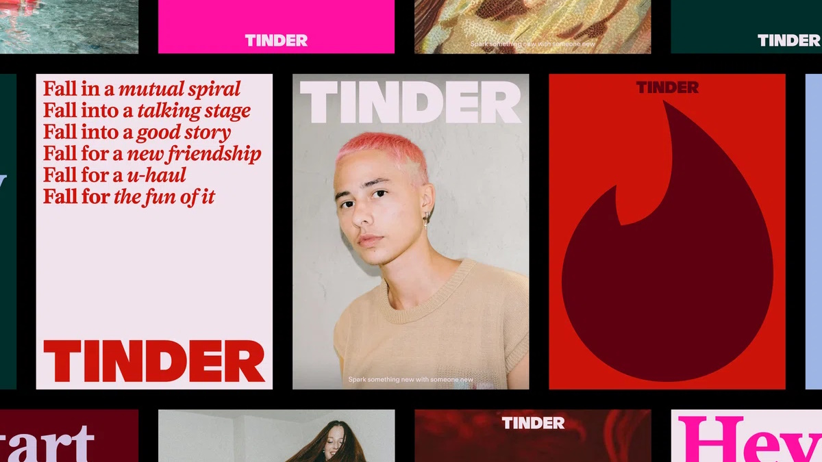
The visual identity incorporates a mix of styles including anime screenshots, oil paintings, and meme-style imagery alongside conventional couple photos. Senior designer Yedo Han noted that this approach reflects the varied visual culture familiar to Gen Z users. The rebrand also updates the wordmark to all-caps, refines the flame icon, and expands the color palette with additional blue and green tones.
Copy updates include small tweaks like changing “happily ever after” to “happily TBD,” signaling a more open-ended view of relationships. The redesign uses the swiping gesture as a design element to reveal different layers of content, aiming to make familiar interactions feel fresh.
The changes come as Tinder faces challenges in user engagement and retention. A 2024 survey indicated that 78% of dating app users experience burnout, with Gen Z particularly affected. Tinder’s paying subscribers declined from 11.1 million in 2022 to 8.77 million in 2025, and nearly half of Gen Z singles reported deleting all dating apps in 2024.
Whether this rebrand will counteract the loss of engagement remains to be seen, but such a major rebrand after such a long time could mark some significant future changes for the platform, or at least an adjustment in how it targets both existing and new audiences.
